Crafting Experiences That Inspire
At our UI/UX design studio, we craft digital experiences that resonate with your audience and drive meaningful engagement. Through in-depth user research and a human-centered design approach, we ensure every interface feels intuitive, beautiful, and purposeful. From sleek visuals to seamless interactions, we design solutions that not only meet user needs but also leave a lasting impression.

Essential UI/UX Design Deliverables
A successful digital product is built on a foundation of rigorous design and strategic planning.
User Personas & Journey Maps
Before a single pixel is designed, we seek to understand the people we are designing for. User Personas are fictional, archetypal representations of your key audience segments, built from real data and research. They keep user goals, motivations, and pain points at the forefront of every decision. Complementing these are Journey Maps, which visually chart the user’s step-by-step experience as they interact with your product. This reveals crucial touchpoints, potential frustrations, and opportunities for improvement, ensuring the entire experience is seamless and intuitive.
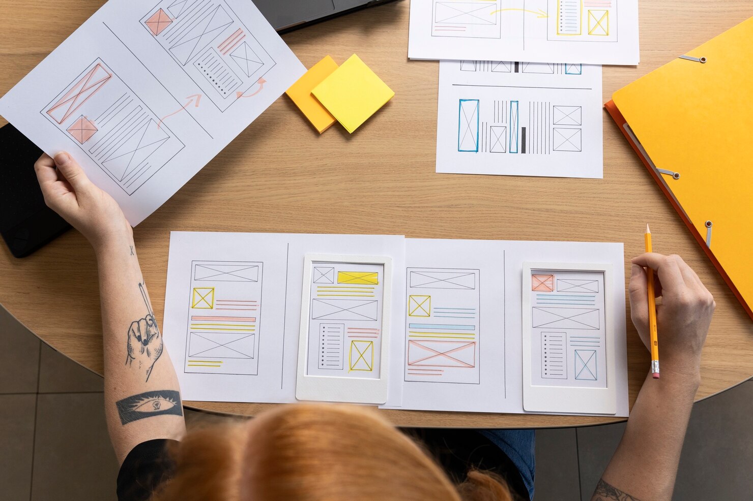
Wireframes
Acting as the architectural blueprint of the project, wireframes are low-fidelity, skeletal outlines of a screen's layout. Stripped of visual design, they focus purely on structure, functionality, and content prioritization. This stage is essential for establishing the fundamental layout and user flow without the distraction of colors or images, allowing for rapid iteration and validation of the core concept.
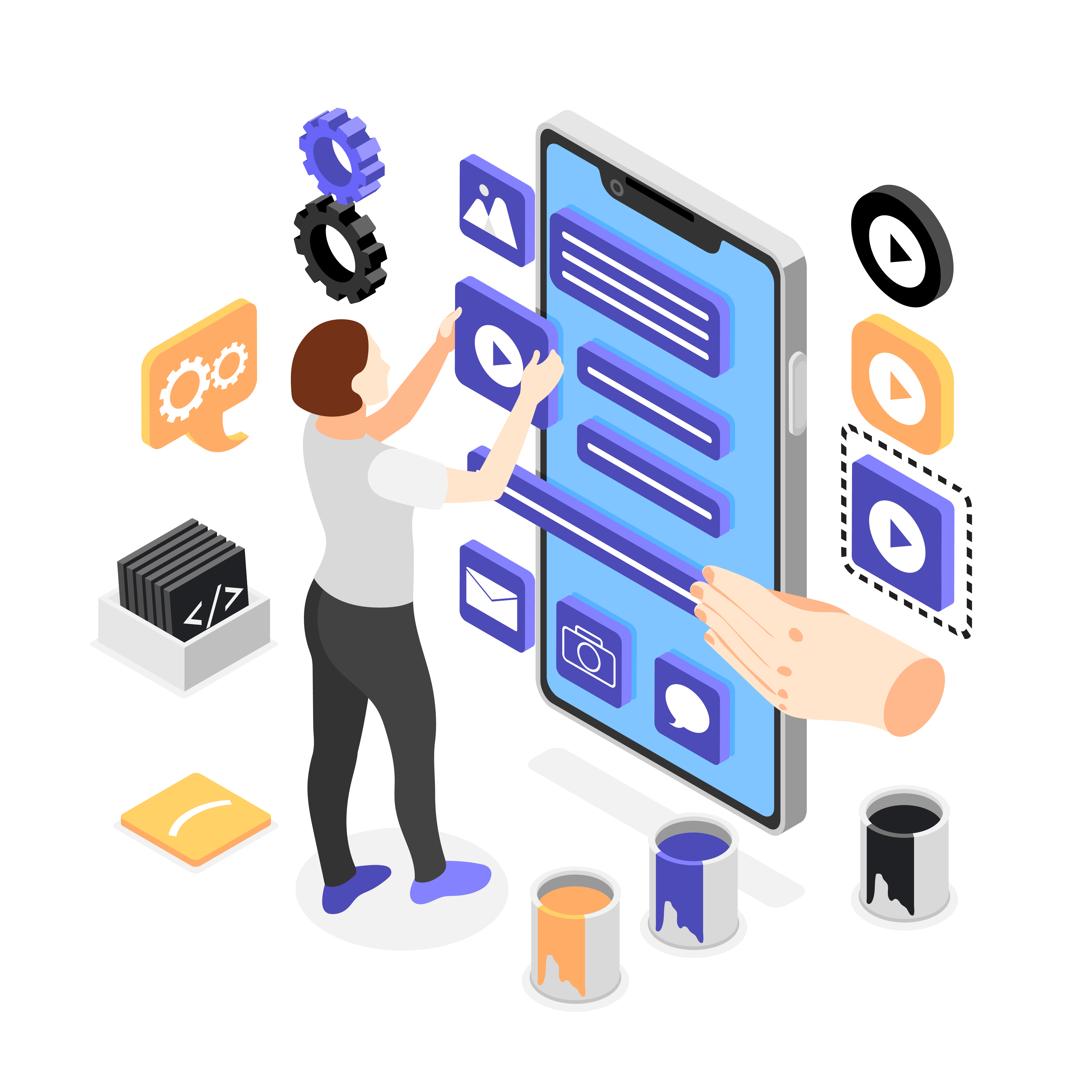
Interactive Prototypes
A prototype transforms static wireframes into a clickable, tangible simulation of the final product. It allows stakeholders and test users to experience the flow, test interactions, and navigate the interface as if it were real. This is a crucial validation tool, identifying usability issues early in the process when changes are least costly, saving significant time and development resources.
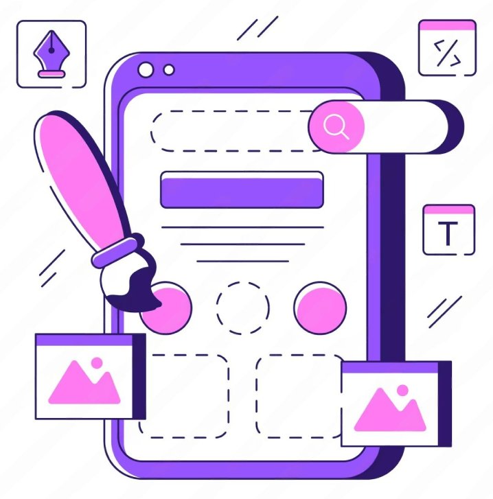
Visual Design Mockups
This is where the experience gains its visual voice. Mockups are high-fidelity, static designs that apply the brand’s visual identity—including color, typography, imagery, and spacing—to the approved wireframe structure. They represent the final look and feel of the product, providing a clear and compelling vision for everyone to see and approve before development begins.

Style Guide
The Style Guide is the single source of truth for the product's visual and interactive language. This comprehensive document details every design element: color palettes, font styles, button states, iconography, and spacing rules. By providing this toolkit, we guarantee visual consistency and efficiency throughout the development phase and for all future iterations, protecting the integrity of the brand.


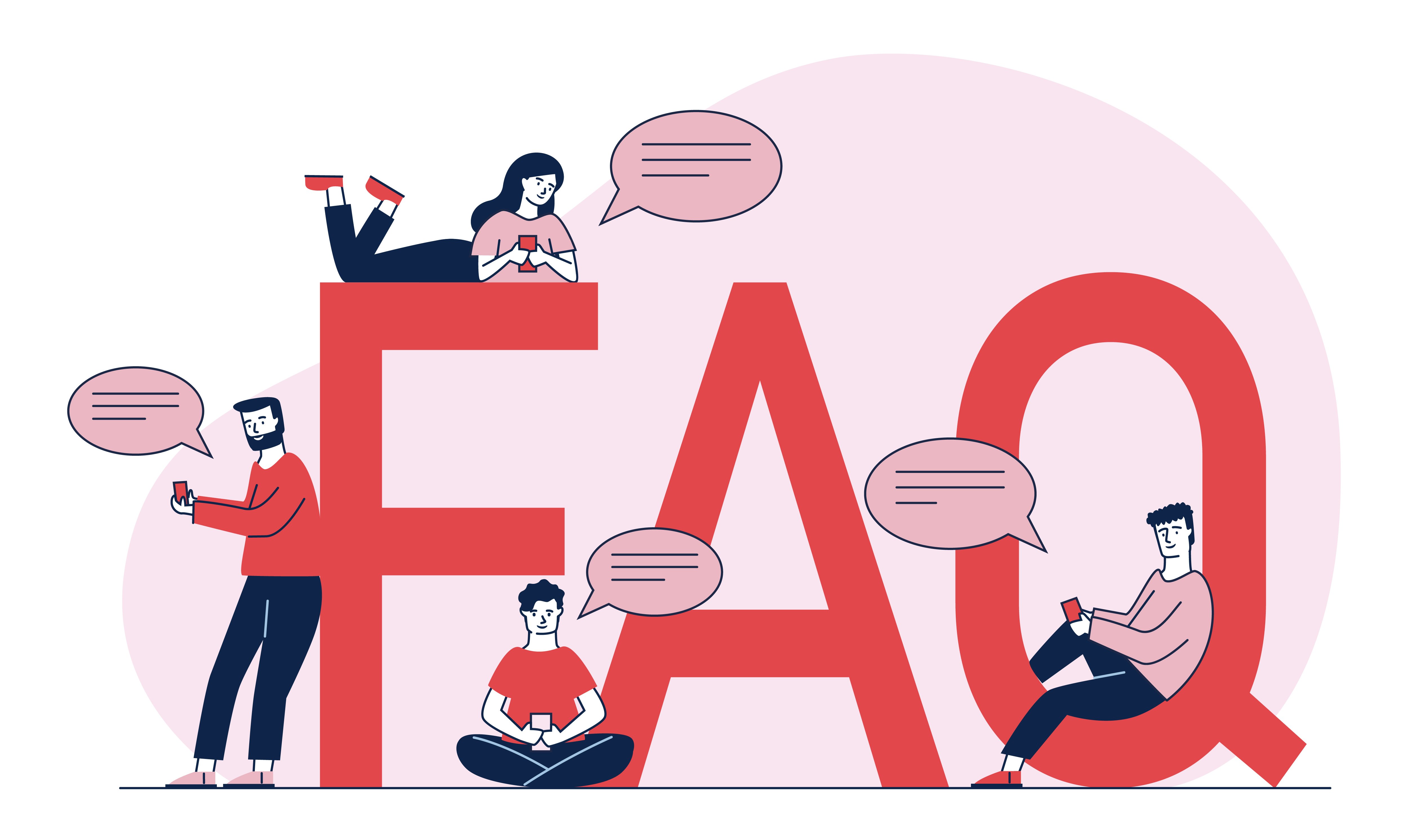
Frequently Asked Questions
As a matter of fact the unification of the coherent software provides a strict control over The Accomplishment of Intended Estimation